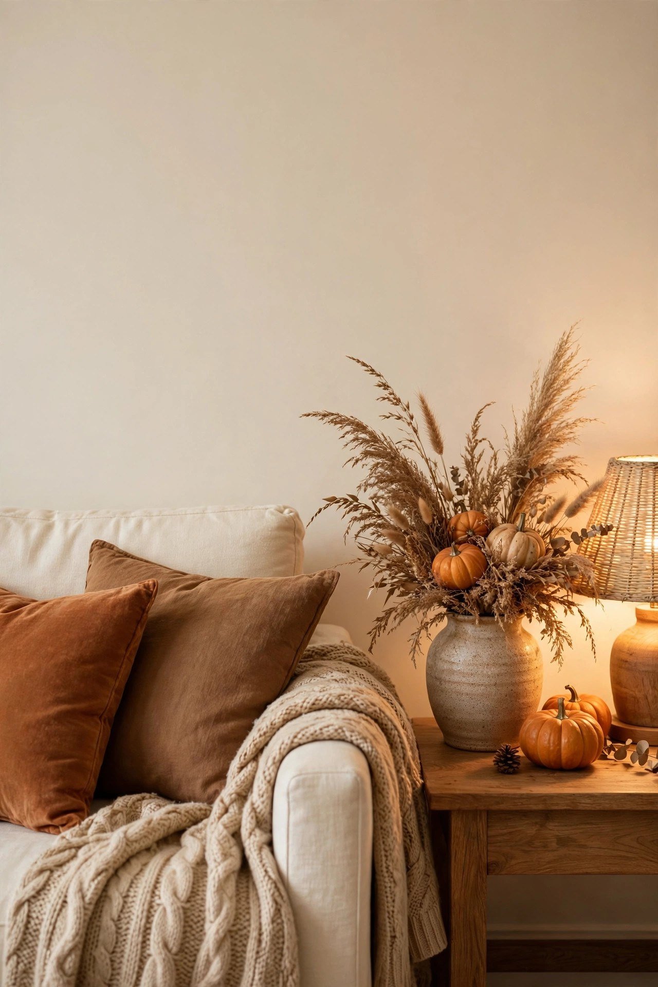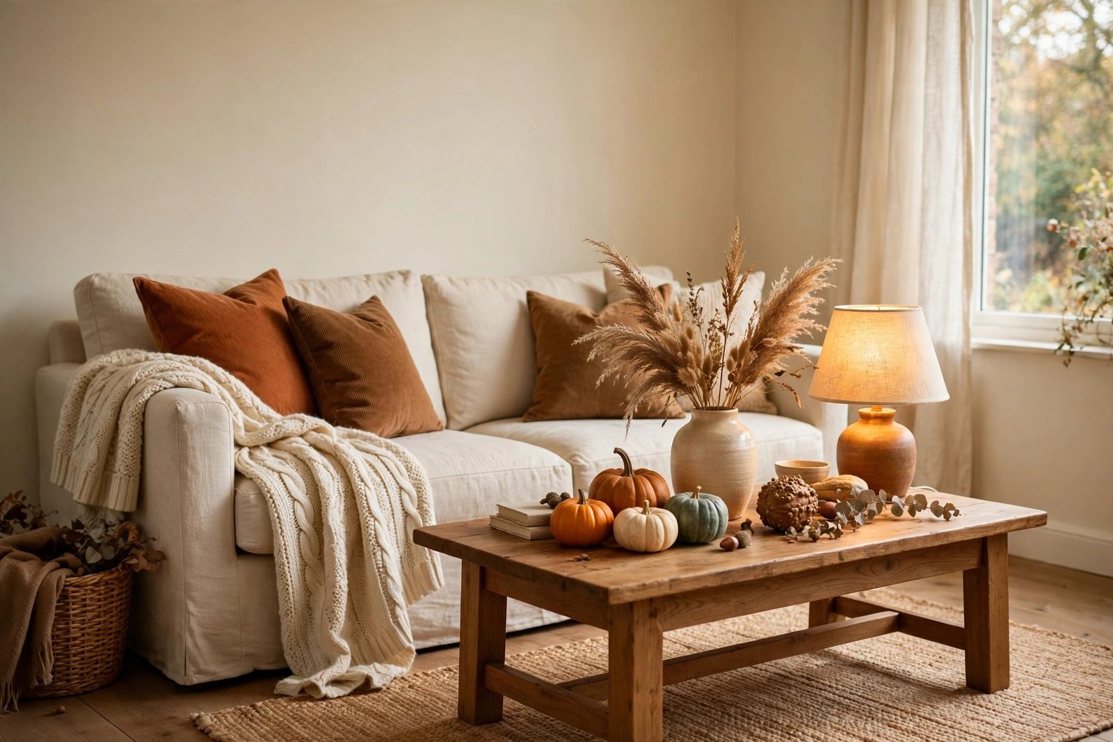
Fall decorating should be the easiest kind there is. The season hands you a ready-made palette — rust, ochre, deep red, warm brown — plus free materials in every garden and park. Yet many homes end up with the opposite of cosy: a room that looks like a discount shop display, all bright orange plastic and lonely little pumpkins dotted around the shelves.
If that sounds familiar, the problem is almost never your taste or your budget. Fall decor turns cheap-looking for a handful of predictable reasons, and every one of them has a warm, inexpensive fix. This guide names the five causes honestly, then walks through the fixes in the order that makes the biggest difference.
Quick Answer
Fall decor looks cheap when it relies on shiny bright-orange plastic, novelty shapes, one flat colour, no texture contrast and small items scattered one by one. The fixes: choose real or matte natural materials, deepen and mute the palette so orange becomes an accent instead of the base, layer textiles for texture, group items into one or two strong displays, and finish with warm lamplight. None of this needs a big spend — most of it is editing what you already have.
Why Fall Decor Tips Into Cheap: The 5 Causes
1. Bright, shiny orange everywhere
The classic fall mistake is a flood of one loud orange — plastic pumpkins, shiny garlands, printed cushions — all in the same saturated shade. Real autumn colour is never that flat or that glossy. Leaves are rust, brick, amber, faded gold and brown, often all on the same branch. A room covered in a single bright orange reads as “seasonal merchandise” instead of “season”, and the shiny finish makes it look cheaper still.
2. Novelty shapes doing all the work
Pumpkin-shaped cushions, leaf-shaped plates, word signs and themed figures are fun in small doses, but when they carry the whole scheme, the room looks like a shop window rather than a home. Novelty says “bought for the season”; shape and texture say “styled for the season”. The cheaper the item, the louder the novelty tends to be — which is why a display built from novelty pieces almost always looks less expensive than one built from plain, natural things.
3. One flat colour with no depth
Even a good colour fails on its own. A room done entirely in orange, or entirely in brown, has no shadows and no highlights, so the eye finds nothing to rest on. Expensive-looking fall schemes are actually several colours deep: a dark base (brown, deep green, charcoal), a warm middle (rust, ochre, terracotta) and a light lift (cream, natural linen, pale wood). Remove two of the three layers and the same objects suddenly look flat and cheap.
4. No texture contrast
Fall is a texture season — bark, wool, dried grasses, rough pottery, smooth gourds. Rooms that look cheap usually have everything in the same finish: smooth plastic next to smooth printed fabric next to a glossy ornament. With nothing rough against anything soft, the display feels stamped out rather than gathered. Texture is also the cheapest upgrade available, because throws, baskets and branches you already own supply it for free.
5. Small items scattered one by one
One small pumpkin on the shelf, one leaf garland strand on the bookcase, one themed candle on the table — spread thinly, small seasonal items look lost, and lost items look cheap. The same pieces gathered into one generous arrangement look deliberate and abundant. Scattering is the single most common cause of the “why does my fall decor look cheap?” feeling, and it costs nothing at all to fix.
The Warm Fixes, In Order
Fix 1: Swap shine for real and matte materials
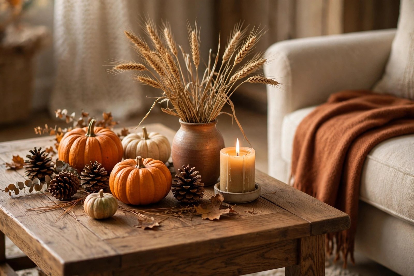
Start by removing anything with a hard plastic shine. Replace it with the real thing where you can — actual gourds and pumpkins, branches with turning leaves, pinecones, dried grasses, nuts in a bowl — or with matte versions in ceramic, wood, woven fibre and unglazed pottery. If a faux piece is all you have, a coat of matte paint in a muted tone calms it down surprisingly well. Real materials also age gracefully, so next year they still look good instead of tired.
Fix 2: Deepen and mute the palette
Rebuild the colour scheme in three layers. Keep a deep, quiet base — warm brown, deep green or soft charcoal in the bigger pieces. Let rust, ochre, mustard and terracotta do the warm middle work in textiles and one or two displays. Then lift everything with cream and natural tones so the room breathes. Bright orange is not banned; it is demoted. Used as one small accent — a single cushion, a few real leaves in a vase — it glows against the deeper colours instead of shouting over them.
Fix 3: Layer textiles until the room feels soft
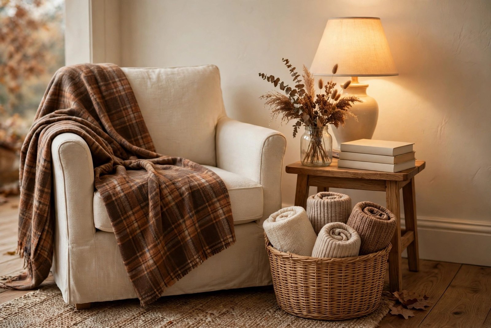
Texture does more for fall warmth than any ornament. Add a heavier throw over the sofa arm, swap cushion covers for deeper tones and rougher weaves, and put a runner or cloth on the table. This is exactly the textile layer of the simple decor rotation system: the same few covers and throws, brought out each autumn, do the heavy lifting while the ornaments stay minor. If your covers look tired, the refresh methods for cushion covers that look flat and boring — a proper wash, better fill, a dye bath in a deeper shade — turn them into fall pieces without buying new ones.
Fix 4: Gather everything into one or two strong displays
Collect every small fall item you own into one pile, then rebuild only two displays: one main arrangement (a mantel, shelf or table centre) and one smaller echo of it across the room. Group in odd numbers, mix heights, and keep the same two or three colours in both displays so they feel related. Everything that does not earn a place in either display goes back in the box. Abundance in one spot reads as generous; the same pieces spread out read as clutter.
Fix 5: Warm the light
Fall rooms live or die by their evening light. Cold white bulbs flatten warm colours and make even natural materials look dull. Use warm-white bulbs in the lamps, light the corners rather than only the ceiling, and add candles or a small string of warm lights near the main display. When the light is warm and low, the deeper palette and the textures suddenly do their job — this is often the fix that makes people say the room finally feels like the photos.
Step by Step: Rescue a Room in One Afternoon
- Gather and sort (20 minutes). Collect all your fall pieces in one place. Sort into three piles: natural or matte (keep), shiny novelty (edit hard), and broken or faded (let go).
- Set the palette (10 minutes). Choose your three layers — one deep base colour, one warm middle, one light neutral — using the biggest textiles you own as the starting point.
- Dress the textiles first (20 minutes). Covers, throw and runner on. This alone usually fixes half the flatness.
- Build the main display (20 minutes). One surface, grouped pieces, mixed heights and textures, orange used once as an accent.
- Add the echo and the light (15 minutes). A small related grouping across the room, lamps on warm bulbs, candles where they will be seen in the evening.
- Photograph and edit (5 minutes). Take a phone photo. Anything that looks shiny, lonely or loud in the picture gets moved or removed.
Materials and Costs
- Real gourds, pumpkins and gathered branches, leaves and pinecones — $0–$8
- Matte paint to calm shiny faux pieces — $4–$7
- Fabric dye in a deeper shade for existing covers — $3–$6
- One heavier throw, if the home has none — $10–$20
- Warm-white bulbs for the main lamps — $4–$8
- Candles or tealights for the main display — $3–$6
A full rescue usually lands between $0 and $35, because most of it is editing, dyeing and rearranging. The seasonal pieces that survive the edit go back into the autumn box, ready for next year.
Mistakes to Avoid
- Buying a full matching themed set. Sets look uniform because they are — same colour, same finish, same scale. A gathered mix of real and matte pieces always looks richer.
- Keeping summer brights in the room. Pale pastels or beachy blues left beside deep autumn tones make both palettes look wrong. Pack the lightest pieces away.
- Decorating every surface a little. Ten surfaces with one item each will always lose to two surfaces done generously.
- Relying on scented novelty candles for atmosphere. One quality candle in a plain holder beats five themed jars, in both looks and scent.
- Judging the room at midday only. Fall decor is evening decor. Check the result with lamps on before deciding it has failed.
More seasonal systems, budgets and fixes are gathered in the seasonal and holiday decor collection.
Frequently Asked Questions
Can cheap plastic pumpkins ever look good?
Sometimes, with help. A coat of matte paint in a muted, chalky tone — cream, sage, terracotta, deep rust — removes the shine that makes them read as plastic, and grouping several together at mixed heights looks far better than single ones dotted around. If they are very glossy or oddly shaped, though, paint cannot fix the shape; those are better replaced by one or two real gourds, which cost about the same.
What if I genuinely love bright orange?
Keep it — as the accent, not the base. One bright orange cushion on a deep green or brown sofa, or a single bowl of bright leaves on a cream cloth, looks intentional and joyful. The colour only starts looking cheap when it covers everything at the same strength, with no deeper or lighter colours around it to give it depth.
How many fall pieces does a room actually need?
Fewer than most people buy. One main display of grouped pieces, one smaller echo, the textile layer (covers, a throw, a runner) and warm light will make a living room feel fully autumnal. In a small room, even the echo can go. The feeling comes from depth of colour and texture, not from the number of themed objects.
Is it worth storing real pumpkins and gourds?
Real ones are for the season only — enjoy them, then compost them. What is worth storing is the permanent kit: the matte ceramics, wooden pieces, baskets, textiles and candles that form the base of the display each year. That stored kit is what makes next year’s decorating fast and nearly free.