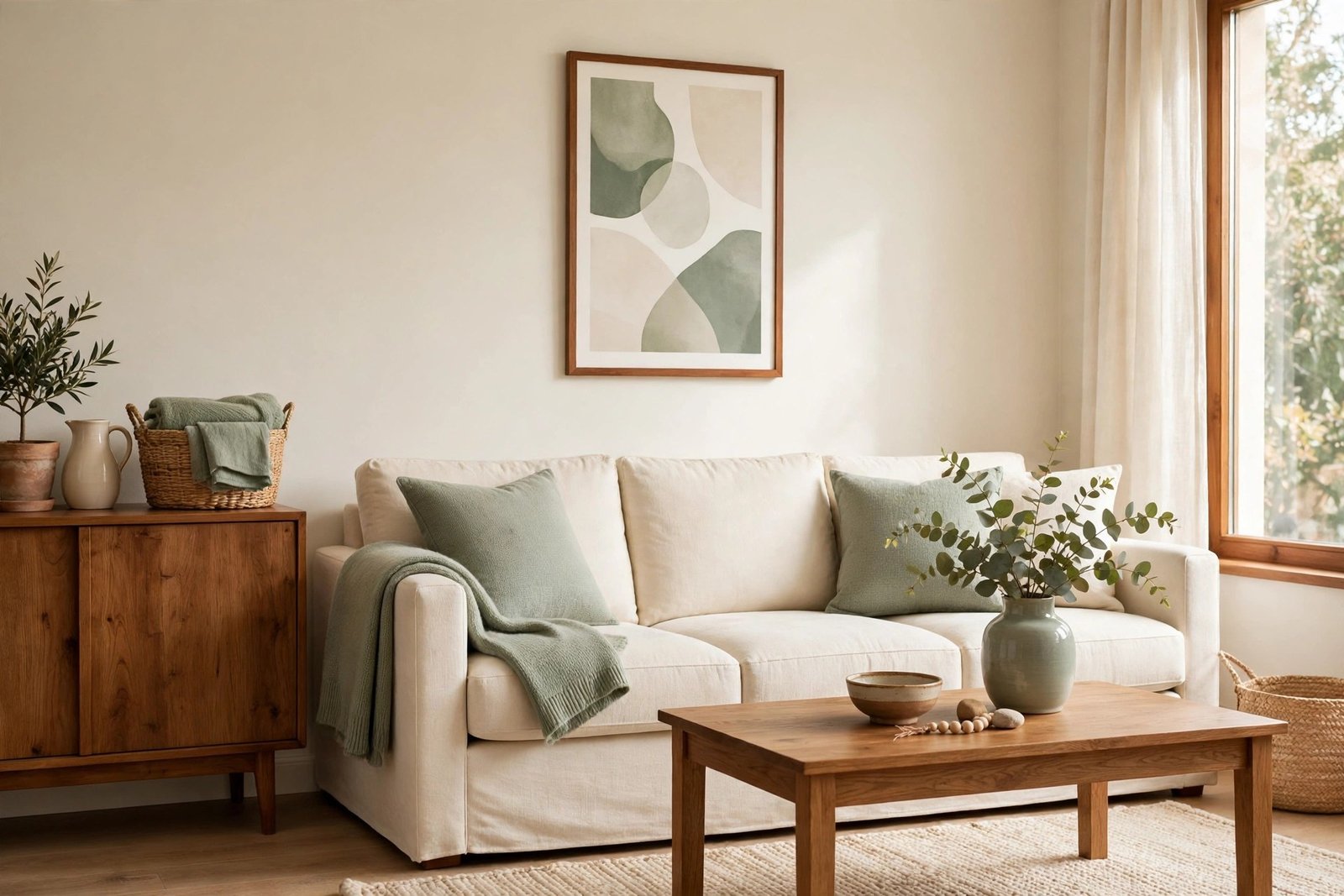
Every item in the room is nice. The rug was a bargain, the cushions are lovely, the chair got compliments. And yet the living room feels restless — your eye jumps from one thing to another and never settles. Nothing is wrong with the pieces. The colours are fighting.
Colour clashes rarely come from one ugly colour. They come from too many strong colours at the same volume, none of them repeated, each one arriving by accident. The fix is not a shopping trip or a colour wheel degree: it is building one simple palette out of what you already own. This guide gives you the method — start from your biggest fixed pieces, share the colours out by the 60-30-10 rule, repeat each one, and retire the clashes without waste.
Quick Answer
Colours clash when several strong colours compete at the same strength and none of them repeats, so nothing connects. Build a palette from what you own: take your dominant colour (about 60%) from your biggest fixed pieces — floor, sofa, walls; choose one supporting colour (about 30%) for the rug, curtains and chairs; add one accent (about 10%) in small doses only. Repeat every colour at least two or three times around the room, let neutrals bridge the gaps, and move — don’t bin — the pieces that belong to no colour in the palette.
Why Colours Clash: The Three Real Causes
Too many generals, no soldiers
A teal sofa, a rust rug, mustard chairs and burgundy cushions are each fine alone. Together, at similar size and strength, they all shout at once. Rooms feel calm when colours have ranks: one leads, one supports, one visits briefly. Clash is usually a ranking problem, not a taste problem.
Nothing repeats
The eye connects a room by finding the same colour in more than one place. A single red cushion in an otherwise blue-and-cream room doesn’t look bold — it looks lost. When every colour appears exactly once, the room reads as a shelf of unrelated objects, however good each one is.
Undertones quietly fighting
Neutrals are not neutral. A warm creamy white and a cool blue-grey white placed side by side make each other look dirty; a warm beige carpet fights a cool grey sofa in the same way. Many “the colours just don’t work” rooms are two undertones at war underneath perfectly reasonable colours — which is why the fixed pieces, the ones you cannot easily change, must set the palette’s temperature.
Step by Step: Build Your Palette From What You Own
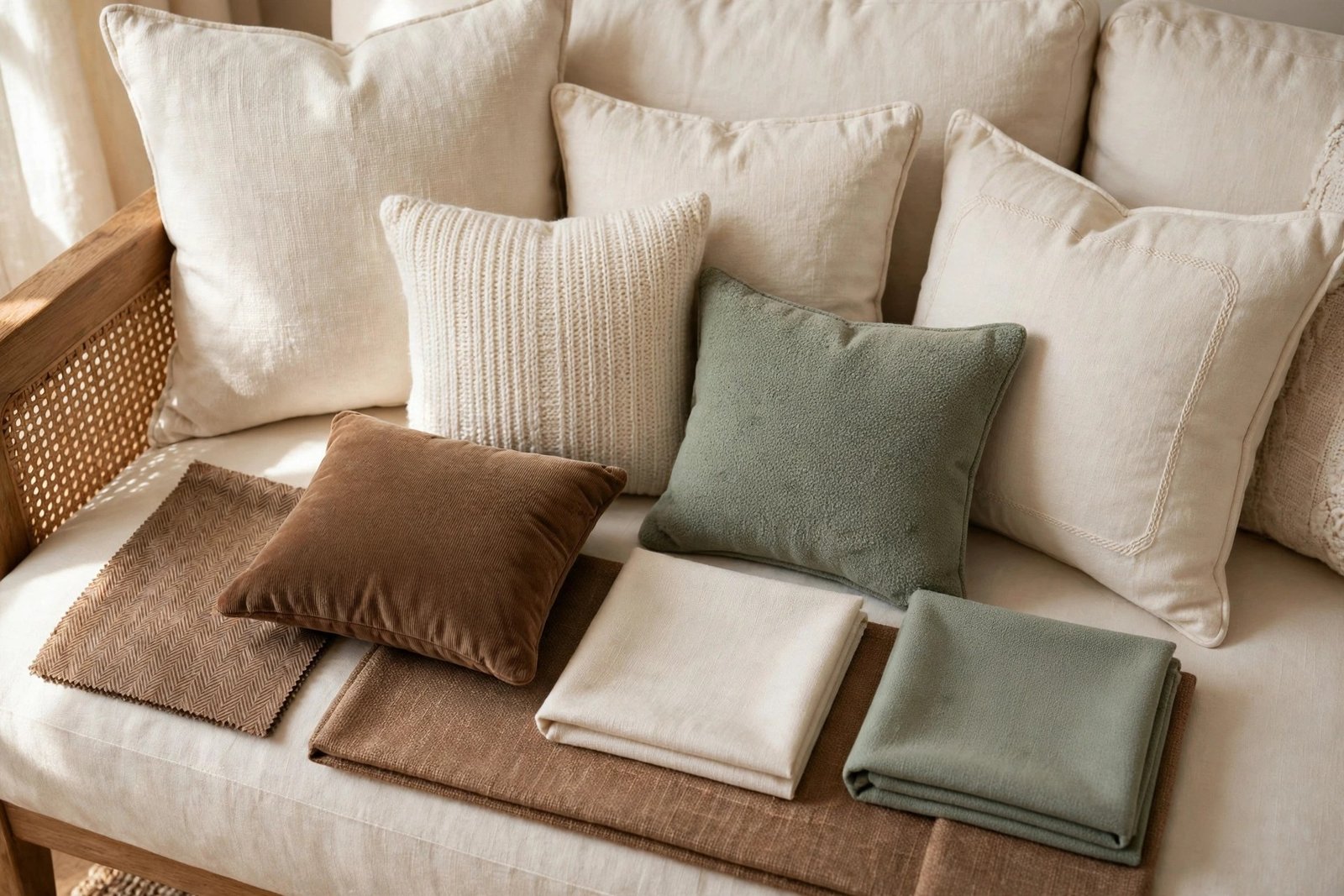
- Start from the biggest fixed pieces. Your floor, your sofa and your wall colour are the palette’s foundation — they are the largest areas of colour and the most expensive to change. Note their colours and, just as important, their temperature: warm (creams, beiges, warm greys, honey wood) or cool (blue-greys, bright whites, ash wood). Every later choice must sit on the same side of that line.
- Give the dominant colour its 60%. In most living rooms the dominant share is a neutral drawn from the fixed pieces — walls, floor, sofa. If your sofa is a strong colour, it may hold the dominant share itself, and the walls and floor become its quiet backing. Either way, about 60% of what you see should be this one calm family.
- Choose one supporting colour for 30%. This is the room’s main “colour” — picked up by the rug, curtains, an armchair, larger cushions. Choose it from something you already own and love in quantity. One supporting colour, repeated, looks designed; three look like a sale rail.
- Add one accent for 10%. The accent is the spark: a strong or contrasting colour used only in small doses — two cushions, a throw, a vase, the art’s main colour. Small is the point. The moment the accent covers a chair, it has been promoted and the balance breaks.
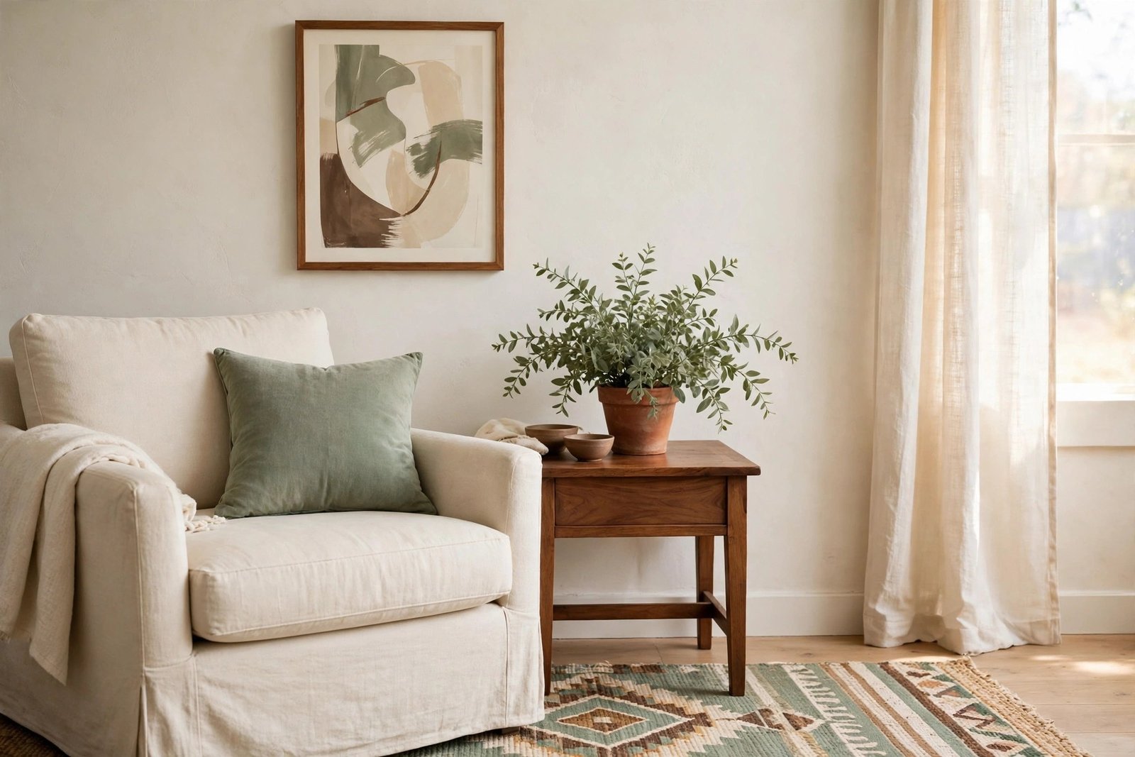
- Repeat every colour at least two or three times. The supporting colour should appear high, middle and low — curtains, a chair, the rug. The accent needs at least two appearances, far apart, so it reads as a thread rather than a spill. Walk the room and count; if a colour appears once, repeat it or remove it.
- Let neutrals do the bridging. Between any two strong colours, a neutral — cushion, throw, wood tone, the wall itself — gives the eye a rest and stops neighbours from vibrating against each other. When two pieces clash directly, separate them with a neutral before blaming either one.
- Test with the phone-photo trick. Photograph the room from the doorway, then look at the photo in black and white. Stripped of colour, you can see the balance: if one item glows far darker or lighter than everything around it, or a whole corner is heavy while another is bare, the distribution is off — move pieces until the grey version looks even. Then check the colour version for any item that still appears exactly once.
Retiring a Clashing Item Without Waste
Every palette edit finds one or two pieces that belong to no colour in the room. They are not bad pieces — they are in the wrong room’s story. Retire them kindly:
- Move rooms first. The teal cushion that clashes here may be exactly the accent a bedroom needs. Do a full walk of the house before anything leaves it.
- Cover or dye it. Cushion covers, a throw over a chair’s back, or fabric dye for washable covers can pull a piece into the palette for a few dollars. A clashing chair wearing a neutral throw with one accent cushion is a new chair.
- Swap, sell or donate. A swap with a friend refreshes two homes at once. Selling or donating passes the piece to a room where it is the missing colour.
- Park it in rotation. If you love it, store it and let it return when the room’s palette swings its way in another season — the decor rotation system is built for exactly this, and a rested piece comes back feeling new.
Materials and Costs
- Cushion covers in your supporting or accent colour — $6–$15 each
- One throw in a bridging neutral — $10–$25
- Fabric dye for washable covers — $5–$10
- Paint sample pots, if you want to test a wall or furniture colour — $3–$6 each
- A simple slipcover for a chair that must change colour — $25–$60
- Swatches or offcuts to test colours together before spending — often free
The palette itself — the choosing and moving — costs nothing.
Related Mistakes to Avoid
- Starting from a paint chart instead of your room. A palette copied from a chart ignores your floor and sofa, the two colours that dominate everything. It is the same trap as copying a photographed room item for item, which the guide to why copying Pinterest rooms fails takes apart in detail.
- Matching everything to one colour. The opposite mistake: a room where the rug, cushions, curtains and art are all the same blue has no ranks and no life. Palette means a family with a hierarchy, not a uniform.
- Adding the accent before fixing the base. New accent cushions on top of a clashing 60-30 base just add a fourth fighter. Sort the big shares first; the accent is the last 10% for a reason.
- Judging colours under harsh light. A palette that clashes under a cold ceiling bulb may sit perfectly in warm layered light. Check your test photo in daylight and in evening lamplight before retiring anything.
- Throwing away the “wrong” pieces. A clash is a placement problem. The piece that ruins this room is the treasure of another — move, cover or rotate it before you bin it.
Clashing colour is one of the eight mistakes in the overview of common decor mistakes that make a finished room feel wrong — and it is often the last one fixed, because it only becomes visible once the placement mistakes around it are sorted.
Frequently Asked Questions
How do I find my room’s undertone?
Hold a sheet of pure white paper against your “white” walls, sofa and floor in daylight. The colour that appears next to it is the undertone: cream, yellow or pink means warm; grey, blue or lilac means cool. Your palette should stay on whichever side the big fixed pieces sit — warm pieces with warm, cool with cool.
Can I have two accent colours?
You can, if they are close relatives (rust and mustard, teal and deep green) and together they still total about 10%, with each repeated at least twice. Two unrelated accents at full strength turn the 10% layer into another shouting match. When in doubt, one accent, done well.
My sofa is a strong colour I can’t change. Can a palette still work?
Yes — the sofa simply takes a leading role. Let it hold the dominant or supporting share, keep walls, floor and rug quiet around it, repeat its colour in just two small places (a cushion pattern, the art), and choose your accent from the opposite side of the colour wheel in tiny doses. A strong sofa is a starting point, not a problem.
What if everything I own is a different colour?
Then neutrals do the heavy lifting: gather your pieces, keep the two largest colour families, and bridge everything with a strong neutral layer — a plain rug, neutral cushions and throws — so the eye reads “calm base with colour on top”. Retire the smallest families to other rooms or rotation. Most mixed rooms settle within one editing session.
1 thought on “Colours Clash in Your Living Room: How to Build a Simple Palette That Works”