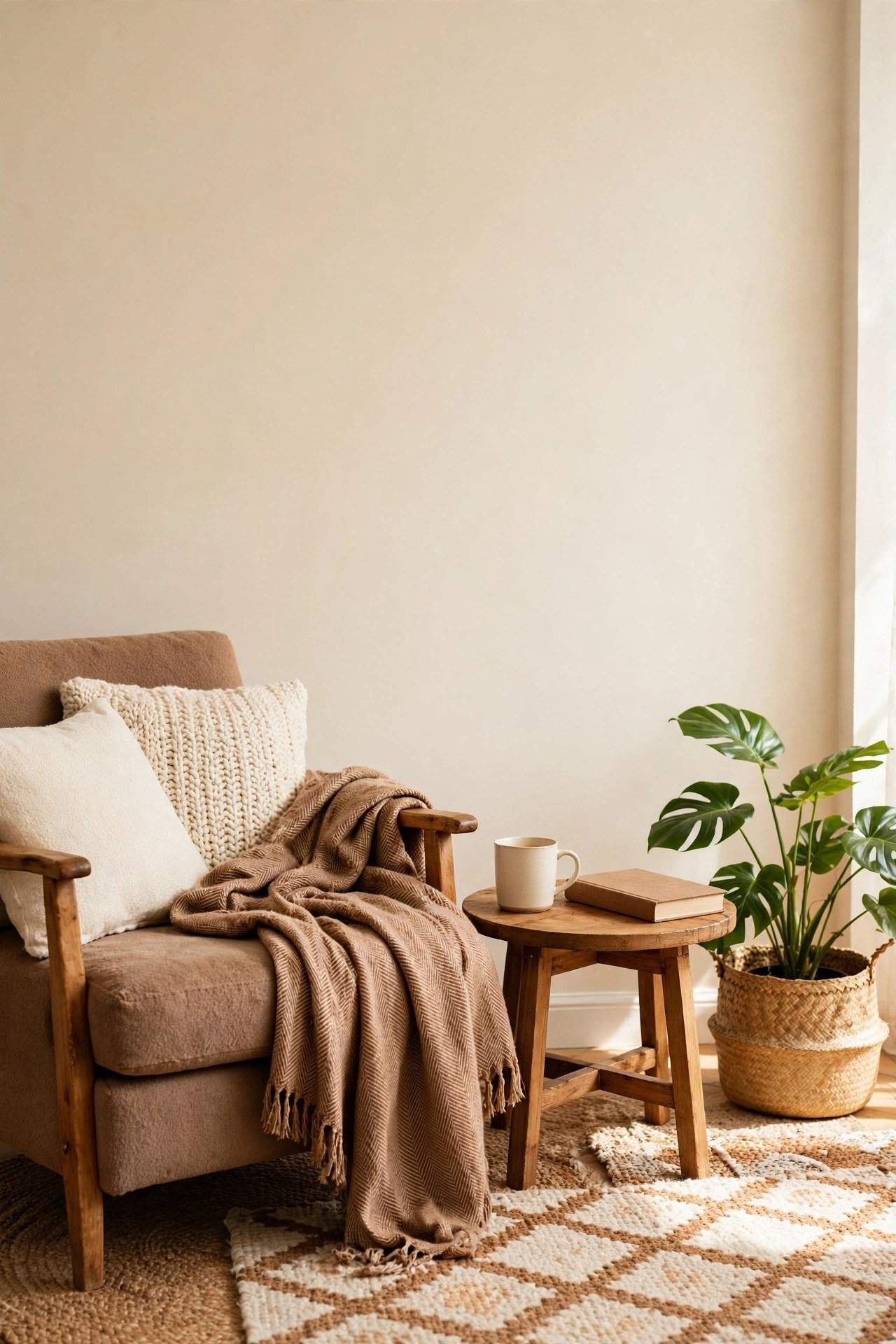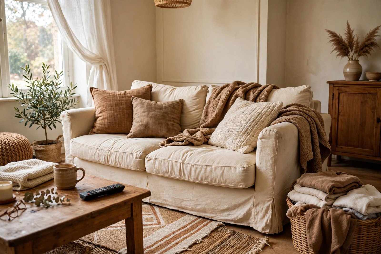
You found the photo. The perfect living room — calm, warm, everything in its place. You saved it, hunted down similar pieces, arranged your room the same way… and it looks like a mess. The sofa is wrong somehow, the colours sit oddly, and the whole thing feels like a costume rather than a room. So you assume you bought the wrong items, and you start shopping again.
Stop. The items are rarely the problem. Copied rooms fail for structural reasons that have nothing to do with your taste or your budget: the photo was staged, edited, taken in a different-shaped room with different light, and half of what makes it work is happening off-camera. This guide explains each reason honestly, then gives you the method that does work — copying the photo’s structure instead of its items — with a worked example on a real small room and a real budget.
Quick Answer
Copying a Pinterest room item for item fails because the photo is a staged, edited image of a different room: different ceiling height, window light and proportions, furniture chosen for the camera, and all the storage and everyday clutter removed from the frame. What transfers is the structure underneath: the layout, the colour ratio (roughly 60-30-10), the list of layers, and where the light comes from. Name what you actually love in the photo, copy those structural choices, and dress them with your own pieces scaled to your own room.
Why the Copy Fails: Five Honest Reasons
1. The room was staged for a camera, not for living
Styled rooms are arranged for one viewpoint. Furniture is pulled into positions that photograph well but block walkways; cushions are plumped for the shot and never sat on; there are no remotes, chargers, blankets-in-use or school bags because a stylist removed them. Your copy has to survive Tuesday evening. Theirs had to survive one shutter click.
2. The photo was edited — and taken through a room-stretching lens
Interior photos are usually shot on a wide-angle lens, which makes a modest room look vast and deep, then brightened and colour-corrected afterwards. The serene pale room you saved may be a fairly ordinary room whose shadows were lifted in editing. You are copying a version of that room that never existed in real light.
3. Your room has different bones
Ceiling height, window size and direction, floor colour, room proportions: these decide how a style lands. The photo’s airy look may rest on a 3-metre ceiling and a huge south-facing window. In a 2.4-metre room with one north-facing window, the same pale palette reads cold and flat, and the same oversized sofa eats the floor. Style is not portable; structure is.
4. The proportions don’t scale
Their rug is 3 × 4 metres under a three-metre sofa in a forty-square-metre room. Scaled by eye into your room, each piece arrives slightly too big or too small relative to the others — and proportion, not any single item, is what your eye was admiring. A copy that ignores measurements breaks the one thing that made the photo work.
5. The storage is off-camera
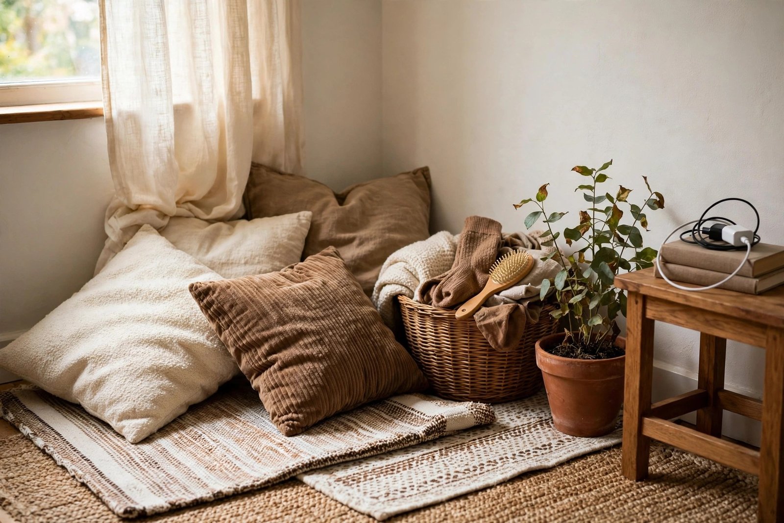
Look again at the photo: where are the books, the paperwork, the toys, the spare blankets, the stuff of life? In cupboards, baskets and other rooms — out of frame. Copied rooms collapse fastest at exactly this point: you reproduce the visible 80% and then your real belongings land on top of it with nowhere to go, which is how a styled copy becomes a mess within a week.
The Translation Method: Copy the Structure, Not the Items
- Name what you actually love. Look at the photo and finish this sentence three ways: “I love how ___.” It is almost never the specific sofa. It is the calm, the warm light, the clear surfaces, the colours’ proportions, the way the seating faces itself. Those are translatable.
- Copy the layout structure. Where does the seating group sit, and what does it face? Is the rug anchoring front legs? Is there one focal point, and are the tall pieces against the walls? Sketch your room and place your own furniture in the same relationships — same structure, your pieces.
- Copy the colour ratio, not the colours. Estimate the photo’s 60-30-10: which share is neutral, which is the supporting colour, which is the accent? Then assign those shares to colours that suit your room’s light and the pieces you own — the method in the guide to building a simple palette that works. A north-facing room may need the photo’s ratio in warmer colours, and that is a correct translation, not a failed copy.
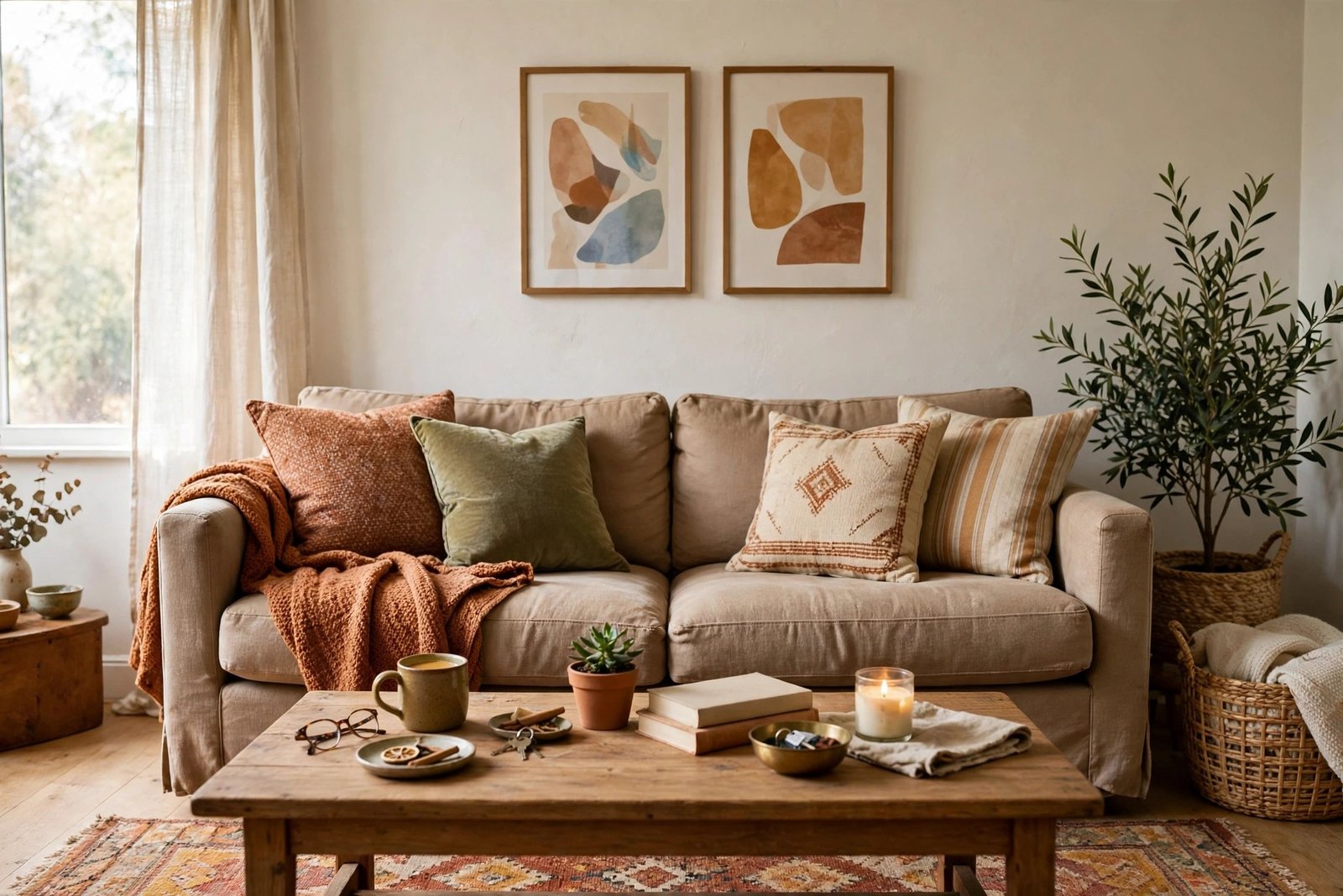
- Copy the layers list. Styled rooms feel finished because they stack the same layers: rug, curtains, cushions at two sizes, a throw, a plant, a lamp at seating height, art at eye level, one tray grouping small things. Write the list, then fill each line with your version at your budget. Missing layers are the most common reason a copy feels “not quite there”.
- Scale everything to your measurements. Measure your room and your biggest pieces, then size each layer to fit them — rug to your sofa, art to your wall, curtains to your ceiling height. Structure scales; items don’t.
- Plan the off-camera part. Before you style anything, decide where your room’s real life goes: the basket for blankets, the tray for remotes, the closed storage for clutter. Use the grouping and breathing-space rules from the guide to fixing a room cluttered with small decor items so the finished look survives contact with an ordinary week.
A Worked Example: One Photo, One Small Room, One Budget
The photo: an airy beige living room — big cream sofa, jute rug, linen curtains, a gallery wall, plants, everything pale and calm.
The real room: 3.5 × 4 metres, rented, one north-facing window, 2.4-metre ceiling — and a mid-grey sofa that is staying.
The translation:
- Structure copied: seating floated around a rug facing the window wall; tall storage kept to one wall; one focal point (the window), art grouped beside it rather than a full gallery wall, which would crowd a smaller room.
- Ratio copied, colours adapted: the photo’s 60% pale neutral becomes warm cream and soft white on the rug, curtains and cushions — warm, because north light turns the photo’s cool beige grey. The grey sofa takes the 30% supporting role the photo’s cushions had. The photo’s 10% accent — black in frames and a lamp — stays black: two frames and one lamp, enough to sharpen the pale scheme.
- Layers filled from a budget: flatweave cream rug $45; linen-look curtains hung high $28; two cushion covers $14; a throw in warm cream $12; one trailing plant $9; frames for prints already owned $10. Total: about $118 — spent only on the layers the room was missing, not on replacing the sofa to match a photograph.
- Off-camera planned: one lidded basket by the sofa for blankets and chargers, one tray on the coffee table for remotes — the room’s real life, given a home before styling began.
The result will not look like the photo. It will feel like it — which was the point all along.
Materials and Costs
- A tape measure and a notebook for your room’s real measurements — $3–$6
- Painter’s tape to test the photo’s layout at your scale before moving furniture — $3–$5
- One lidded basket for the off-camera storage every styled room hides — $8–$15
- One tray for grouping everyday items — $5–$12
- Layer fillers as your own audit finds them (rug, curtains, cushions, throw, plant) — buy only the missing lines, typically $50–$150 total
Related Mistakes to Avoid
- Buying the exact items from the photo. Even a perfect match lands in different light and different proportions. Buy the layer your room is missing, in your room’s palette and scale.
- Copying colours without checking your light. Hold swatches and cushion covers against your wall at the time of day you use the room most. A colour that sings in a south-facing photo can die in your north-facing room.
- Styling before solving storage. If the everyday items have no home, the styled look lasts one day. Storage first, cushions second.
- Deciding the photo “didn’t work” and starting over with a new photo. That loop is the most expensive decor habit there is. One photo, translated properly, will teach you more about your room than ten copied shopping lists.
More placement, proportion and “it looks right but feels wrong” diagnoses live in the decor mistakes and how to fix them collection.
Frequently Asked Questions
Is it ever worth copying a photo room exactly?
Only in one case: when your room genuinely matches the photo’s bones — similar size, ceiling height, window direction and floor colour — and even then, copy the structure first and the items second. In practice, an exact match of bones is rare, which is why translation beats copying almost every time.
How do I know which part of a photo I actually love?
Try the squint test: blur the photo (squint, or shrink it small on your phone) until the items disappear and only shapes, light and colour proportions remain. Whatever still pleases you in the blurred version is the structure — that is the part to copy. If nothing survives the blur, you loved an item, and one item is easy to buy honestly.
The rooms I save all look bigger than mine. Am I choosing wrong?
The camera is choosing for you: wide-angle lenses make saved rooms look bigger than they are, so your room may be closer in size than it appears. Measure instead of guessing — many “huge” photo rooms are ordinary rooms, well translated.
Can I translate a photo room in a rental?
Yes — translation is the renter-friendly approach, because it works through layout, textiles, lamps and layers rather than paint and built-ins. Hang curtains high with removable fixings where needed, lean larger art instead of drilling, and let the rug and lighting do the structural work.